

Southern Mobility had earned its reputation as a trusted provider of mobility solutions through years of dependable service and a deep, information-rich product catalog. But beneath that credibility sat a storefront quietly struggling under the weight of its own history. Built on a legacy BigCommerce Blueprint framework, the site had accumulated layers of customizations, dense product content, and CMS pages created over time by different teams and under different assumptions. What once felt robust had become rigid. What once felt informative had become overwhelming.
Customers were expected to navigate crowded category pages, parse heavily loaded product pages, and mentally assemble answers from scattered information. Internally, even minor design or content changes required disproportionate effort. The platform was no longer keeping pace with modern UX expectations or the operational demands of a growing business.
Southern Mobility didn’t want a risky teardown or a flashy redesign that erased familiarity. They needed a Blueprint-to-Stencil migration that preserved trust, retained critical workflows, and improved clarity without disrupting day-to-day operations. That’s when WebDesk Solution entered the story, not as a vendor executing tasks, but as a strategic partner tasked with turning a high-risk migration into a controlled evolution. The goal was clear: modernize the storefront, restructure decision-making, and create a scalable, future-ready BigCommerce experience without losing what already worked.
Approach
From the outset, WebDesk Solution treated this as a systems-level transformation, not a theme swap. Our team began with a comprehensive audit of Southern Mobility’s existing Blueprint environment, analyzing custom headers, footers, product templates, category layouts, CMS pages, third-party apps, and backend workflows. The objective was to identify which elements were mission-critical, which were adding friction, and which could be re-engineered for clarity within a modern Stencil framework.
Rather than pushing a single solution, WebDesk presented multiple Stencil migration paths, including V2 and V3 options, along with curated theme recommendations. Each path was evaluated for design flexibility, performance impact, customization effort, and long-term scalability. This allowed Southern Mobility to make informed decisions grounded in trade-offs, not assumptions.
Once the Beautify – Family theme and Stencil V2 migration were finalized, WebDesk established a structured rollout plan covering product pages, category pages, and over 36 CMS pages. Proofs of Concept were created early to validate design direction and functional behavior before full deployment. Throughout the project, documentation, transparent communication, and iterative feedback ensured alignment at every stage.
The approach balanced strategy and execution, ensuring the migration didn’t just modernize the platform, but fundamentally improved how customers browse, evaluate, and decide, while giving internal teams a cleaner, more maintainable system.
Challenges
Trapped in a Legacy Framework That Quietly Limited Growth
Southern Mobility’s Blueprint-based storefront had become a structural bottleneck, even though it continued to function on the surface. Over the years, the platform accumulated critical customizations that supported daily operations, but Blueprint’s rigid architecture increasingly constrained design evolution, performance optimization, and modern UX adoption. Even relatively small enhancements required workarounds, increasing technical debt and slowing iteration.
Out-of-the-box themes offered limited expressive range and could not fully reflect the brand’s maturity or product depth. Key components required refinement, some were missing altogether, and internal pages lacked consistent visual standards. At the same time, the internal team had developed deep operational familiarity with existing workflows, meaning a full teardown or aggressive redesign carried serious risk: retraining costs, process disruption, and potential revenue instability.
The challenge was not simply technical; it was strategic. Southern Mobility needed to modernize into a BigCommerce Stencil framework that supported scalability and performance, while preserving institutional knowledge, operational efficiency, and customer familiarity. Any misstep could compromise trust, slow business operations, or introduce instability into a revenue-critical channel.
Information Density Without Hierarchy Undermining Buyer Confidence
Southern Mobility’s product pages suffered not from a lack of information, but from years of unstructured accumulation. Specifications, options, trust badges, promotions, policies, videos, and supplemental content had all been layered in with good intent. Individually, each element added value. Collectively, they created a page that demanded too much cognitive effort from the user.
Critical decision-driving information was buried among supporting details, forcing customers to scan, interpret, and prioritize content on their own. Feature lists read as technical inventories rather than benefit-driven narratives. Configuration options appeared simultaneously, increasing anxiety instead of guiding progress. Technical data existed without context, requiring users to translate specifications into real-world relevance.
For a high-consideration product category, this structure created friction at the worst possible moment: when users needed reassurance and clarity. Instead of building confidence, the page placed the burden of understanding on the buyer. This resulted in hesitation, longer decision cycles, and increased abandonment, not because the products lacked value, but because the experience failed to clearly communicate it.
A Category Experience That Listed Products but Didn’t Support Decisions
Southern Mobility’s category pages presented extensive product selections, but lacked the structure necessary to help users make sense of them. Large grids of visually similar products appeared with minimal differentiation, leaving customers to interpret differences without guidance. While filters and sorting tools existed, they were not framed or prioritized in a way that aligned with how users naturally shop or evaluate mobility products.
Visitors often arrived with intent, whether comparing features, narrowing options, or identifying the best fit for a specific need. Instead of being supported, they were confronted with a catalog-style layout that emphasized volume over clarity. There were no clear pathways, recommendations, or visual cues to indicate common use cases, best sellers, or practical distinctions.
From a UX standpoint, the page increased cognitive load. From a business standpoint, it slowed movement toward purchase and increased bounce risk. Browsing felt like work rather than discovery. The challenge was to transform the category page from a passive listing environment into an intent-driven decision framework that actively supported evaluation and comparison.
Fragmented CMS Content Threatening Brand Consistency at Scale
With over 36 CMS pages created across different timelines and design assumptions, Southern Mobility’s content ecosystem lacked cohesion. Fonts, spacing, layouts, and visual patterns varied widely, causing the site to feel fragmented despite strong messaging and valuable information. This inconsistency weakened brand perception and made the site feel less polished and trustworthy.
Migrating this volume of content during a theme transition introduced significant risk. Without a structured approach, pages could easily lose formatting, visual alignment, or even data. More importantly, without a standardized system in place, the same inconsistency would continue post-migration, compounding maintenance challenges and increasing long-term costs.
The challenge extended beyond migration logistics. Southern Mobility needed a scalable CMS structure that ensured consistency today and prevented fragmentation tomorrow. The goal was not just to move content safely, but to establish a unified visual language and reusable framework that would support ongoing growth without continuous developer intervention.
Key Metrics




Solutions
A Strategic Blueprint-to-Stencil Evolution Without Operational Disruption
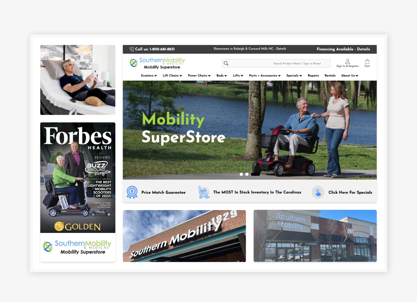
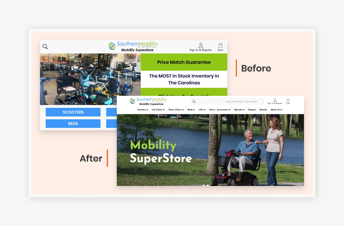
WebDesk Solution approached the BigCommerce Blueprint-to-Stencil migration as a controlled evolution, not a disruptive rebuild. Every existing customization, including mega menus, quick view functionality, wishlists, product badges, custom templates, and backend workflows, was carefully audited and mapped before migration. This ensured that no critical functionality was lost and that internal teams could continue operating without interruption.
Rather than forcing heavy customization, WebDesk curated Stencil theme options aligned with the client’s product structure and business needs. The selected Beautify – Family theme provided a flexible foundation that could be refined without overengineering. Design enhancements were applied strategically within the theme’s framework to maintain stability and long-term maintainability.
The homepage underwent multiple structured revision cycles to align branding, layout, and content hierarchy. Proofs of Concept for product, category, and About pages allowed stakeholders to validate functionality and visual direction early, reducing risk and ensuring alignment. The outcome was a modern, scalable storefront that preserved operational familiarity while unlocking the flexibility required for future growth.
Rebuilding Product Pages as Guided, Confidence-Driven Experiences
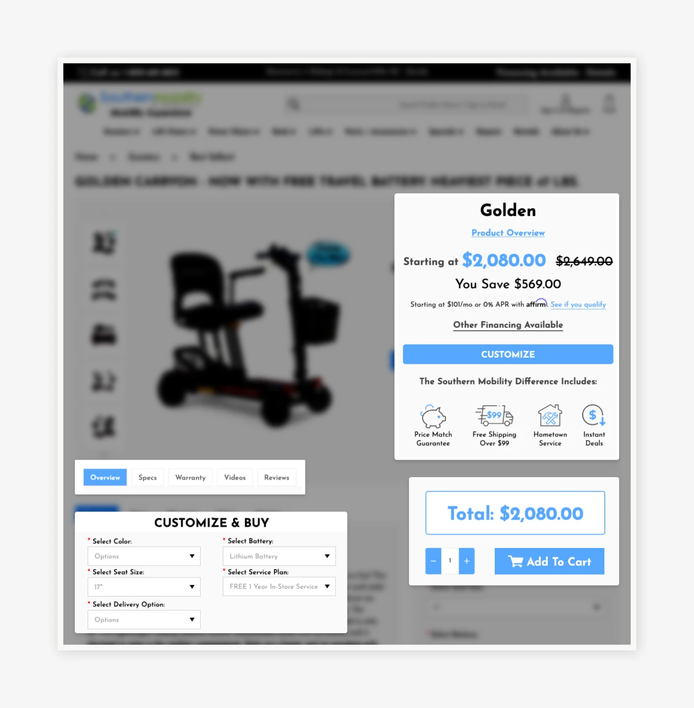
WebDesk re-architected the product page to function as a guided decision journey rather than a static content repository. The structure was rebuilt around how users naturally evaluate high-consideration products: first understanding value, then exploring details, and finally committing with confidence.
Core elements, product title, pricing, and primary value messaging, were grouped alongside the main image to establish immediate clarity. Key differentiators were elevated early, clearly communicating why Southern Mobility’s offerings stood out before users encountered deeper content. This ensured value was understood before complexity was introduced.
Information was reorganized into intent-aligned sections, allowing technical specifications and supporting details to be accessed without overwhelming the initial experience. Features were reframed in benefit-driven language, connecting attributes to real-world outcomes. A custom CTA flow guided users toward configuration rather than prematurely pushing them to add to cart.
Dynamic pricing updates in real time as selections are made, eliminating uncertainty and reinforcing trust. Together, these changes transformed the product page into a calm, informative conversation that builds confidence and reduces hesitation through structure alone.
Transforming Category Pages Into Intent-Driven Shopping Journeys
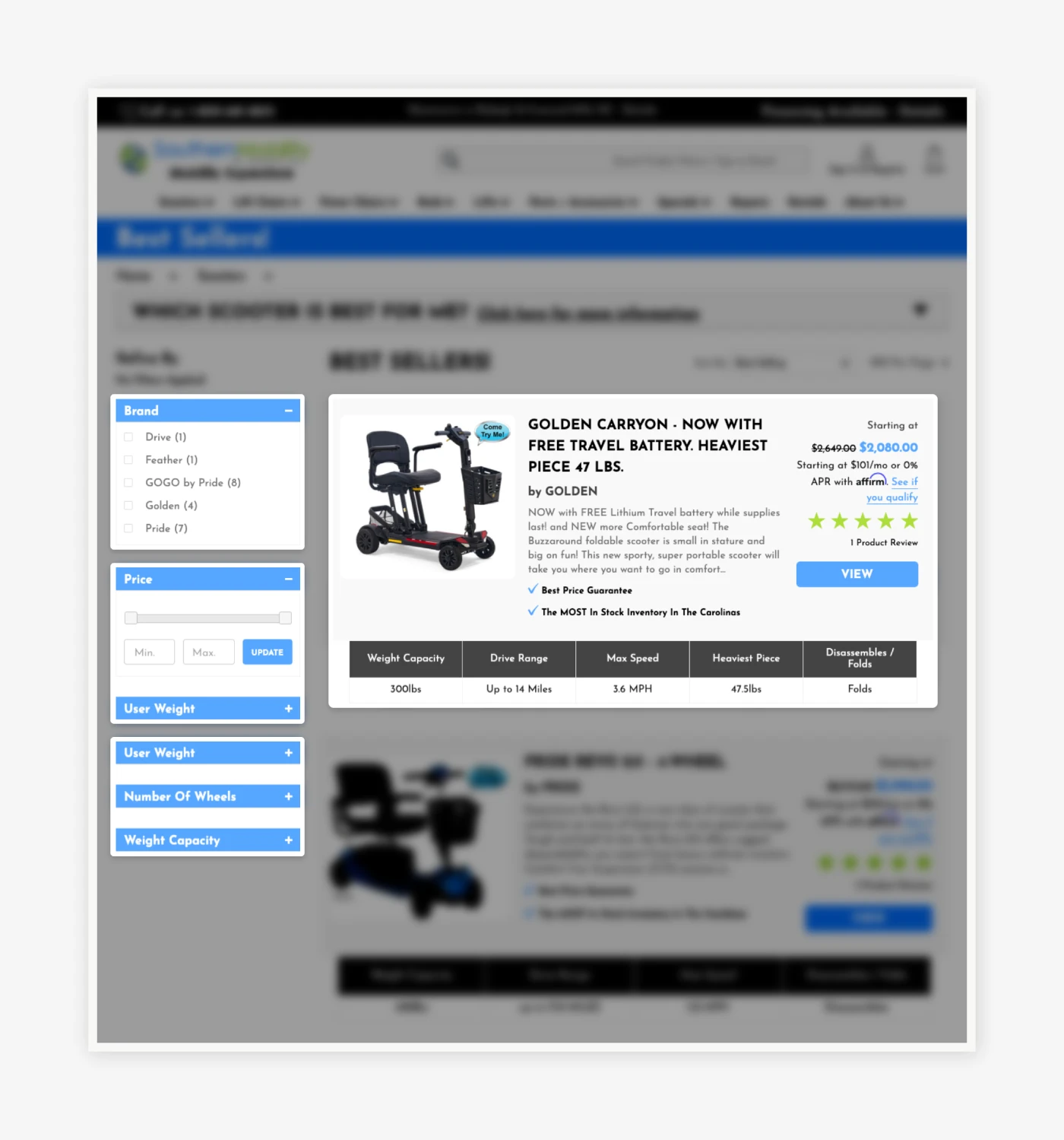
To address browsing friction, WebDesk redesigned category pages around user intent and decision support rather than raw product volume. Above the fold, clear headings and concise descriptions provide immediate context, helping users understand the category’s purpose and scope.
Filters were reorganized into logical, user-friendly groupings and presented progressively, allowing customers to refine results without feeling overwhelmed. This structure mirrors how users think, narrowing options step by step rather than confronting them with every choice at once.
Product cards were enhanced to surface key attributes, benefits, and visual indicators directly within the grid. Badges and micro-highlights guide attention to important distinctions, enabling faster comparison without requiring users to open multiple product pages. This reduced friction, accelerated discovery, and encouraged confident exploration.
The result is a category experience that feels intentional and supportive, turning browsing into an efficient, guided process that moves users naturally toward purchase.
Establishing a Unified, Scalable CMS Design System
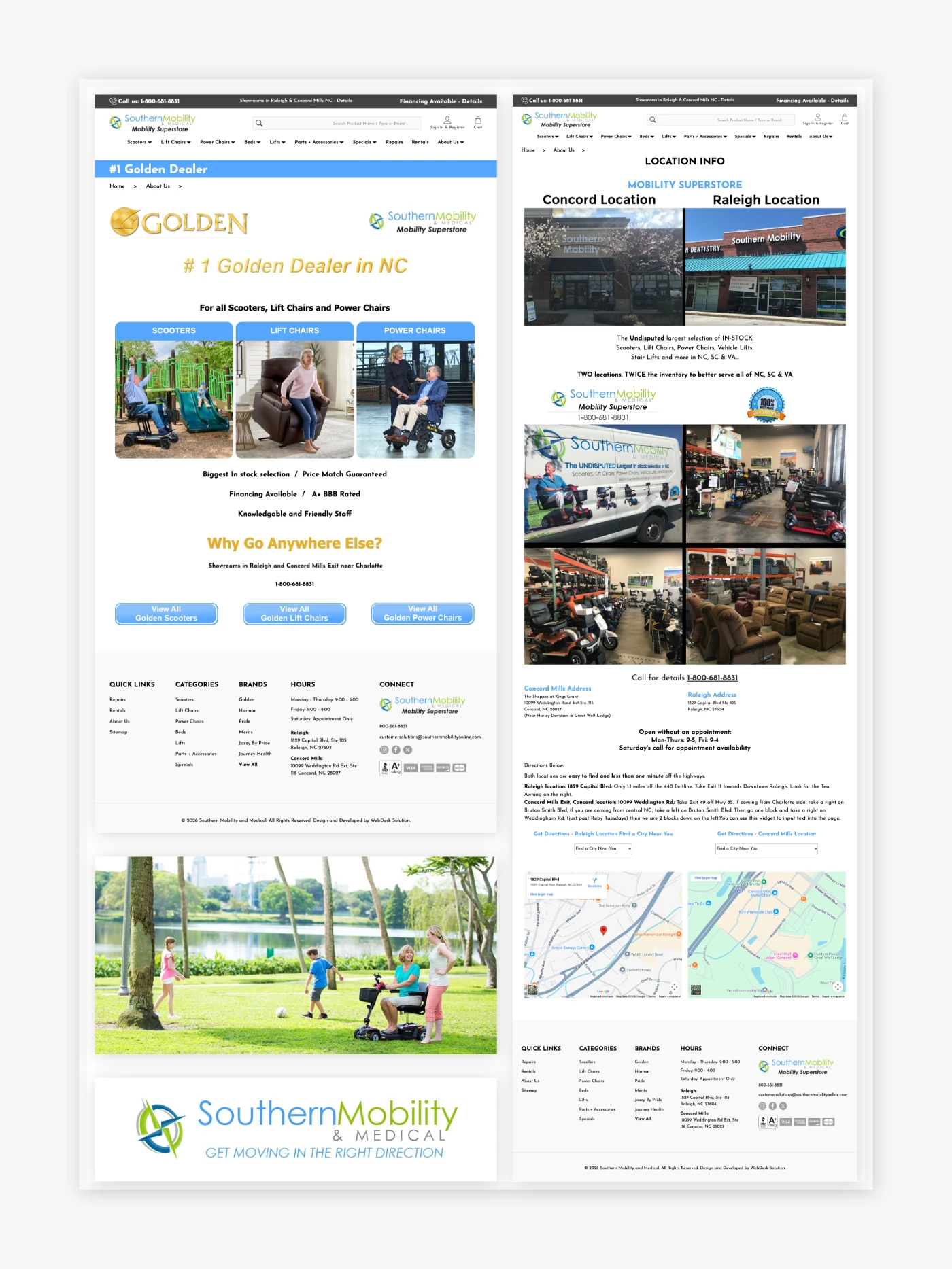
WebDesk approached CMS migration as a system design initiative, not a page-by-page task. Each CMS page was carefully migrated and aligned to consistent typography, spacing, color usage, and layout rules defined by the new Stencil theme. This ensured immediate visual cohesion across all content types.
Where unique layouts were required, WebDesk developed reusable templates that could be applied consistently across future pages. This eliminated the need for one-off custom builds and empowered the internal team to scale content without compromising brand standards.
Policies, informational content, videos, forms, and supplemental pages were unified under a single visual language, creating a seamless experience regardless of entry point. The final CMS ecosystem is not only consistent and polished, but also future-ready, reducing long-term maintenance effort while protecting brand integrity as the site continues to grow.
Outcomes / Results
Conversion Rate: Increased by 20% within the first month post-launch
The redesigned product and category pages guided users intuitively through decision-making, reducing hesitation and frustration. Clearer calls-to-action, simplified workflows, and intent-driven content helped buyers progress through the site confidently. As a result, more visitors completed purchases, reflecting a measurable lift in engagement and checkout efficiency.
Revenue Growth: Achieved an 18.06% increase
By presenting products and content more clearly and prioritizing high-value items, Southern Mobility saw a significant boost in total revenue. The combination of structured product information, intent-driven category layouts, and unified CMS messaging encouraged larger transactions and repeat engagement, translating design improvements directly into financial impact.
Orders: Grew by 13.69%, reflecting reduced decision friction
Simplified navigation, enhanced filtering, and visually guided product comparisons allowed buyers to make faster, more confident decisions. The structured journey minimized cognitive overload, which reduced cart abandonment and increased order volume. More users moved from browsing to completing transactions, driving a measurable uplift in total orders.
Average Order Value: Increased by 3.84% as users confidently configured higher-value purchases
Intent-aligned product pages and dynamic configuration tools empowered users to explore advanced options and add complementary products. Buyers were able to understand value clearly, make informed choices, and complete larger purchases without confusion. This led to an increase in average order size, enhancing overall profitability.
Conclusion
Southern Mobility’s transformation is a clear example of how strategic planning, technical precision, and user-focused design can turn legacy constraints into competitive advantages. Through a carefully executed BigCommerce Blueprint-to-Stencil migration, WebDesk Solution preserved critical functionality while introducing modern UX principles that improved clarity, confidence, and scalability.
Product pages now guide decisions instead of overwhelming users. Category pages support intent rather than forcing interpretation. CMS content speaks with a unified brand voice across every touchpoint. Together, these improvements created a platform that serves both customers and internal teams more effectively.
This project reinforces WebDesk Solution’s role as a trusted partner for complex, high-stakes BigCommerce migrations, capable of delivering modernization without disruption and clarity without compromise.